
Roadmap
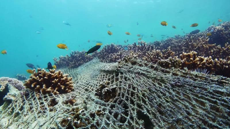
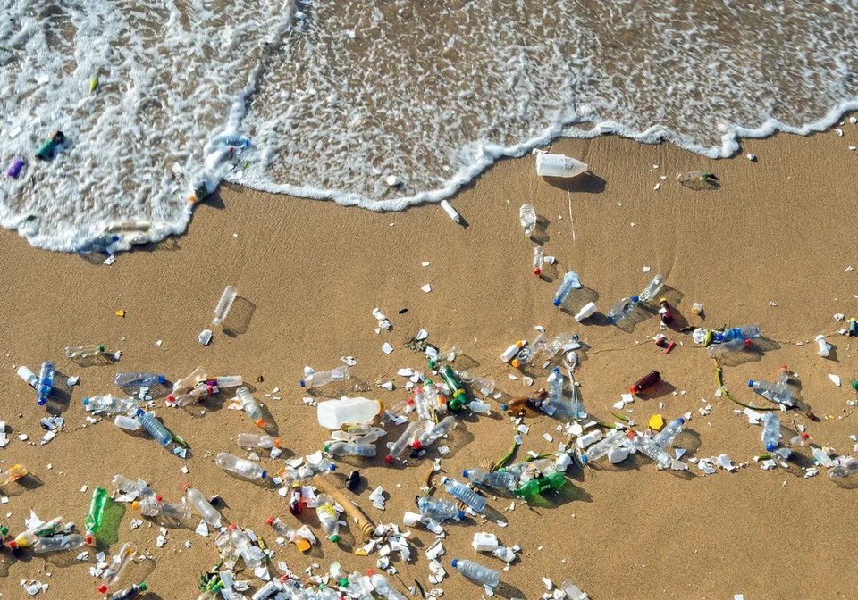
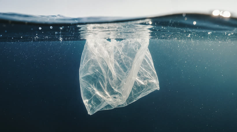
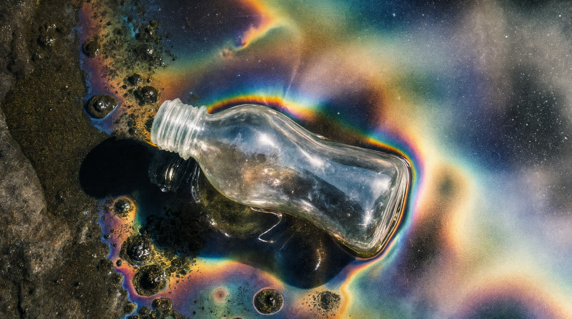

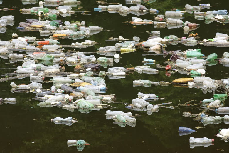
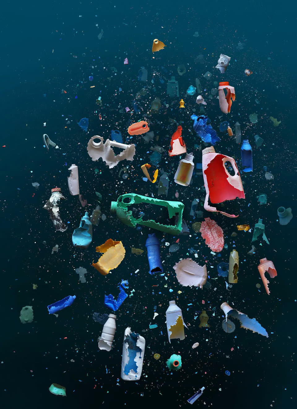
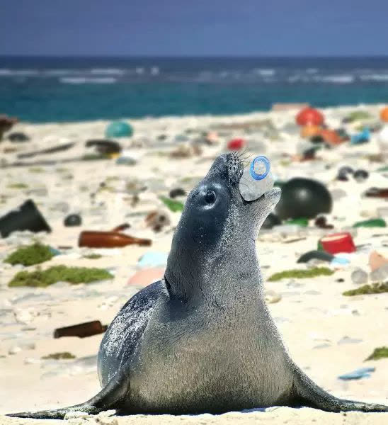
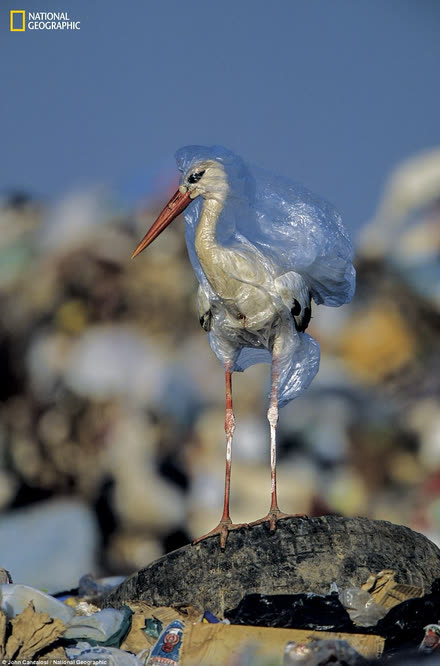
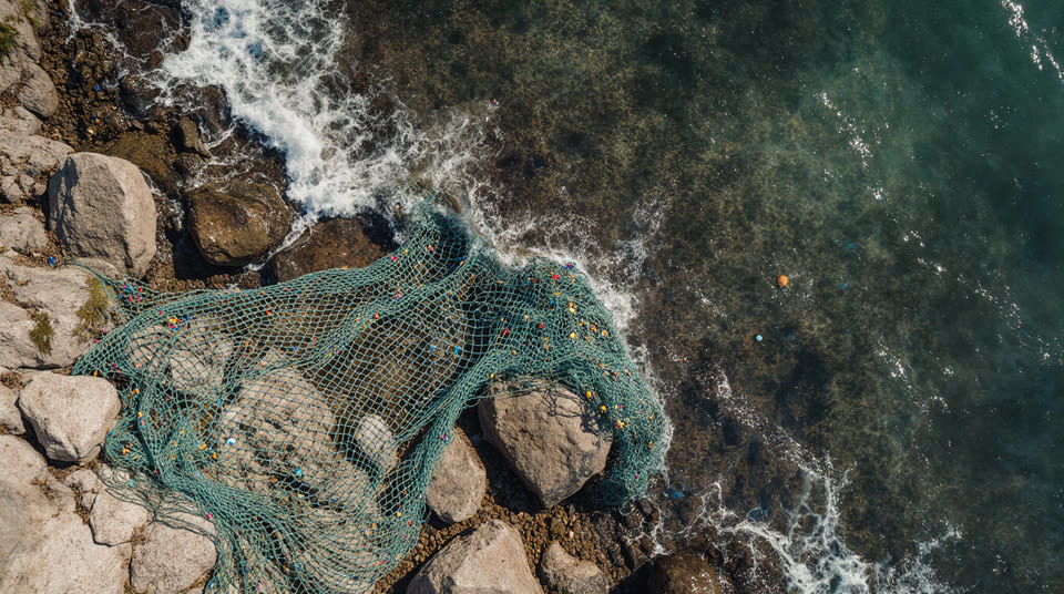

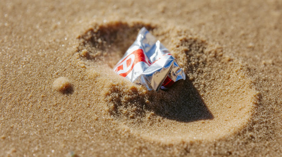
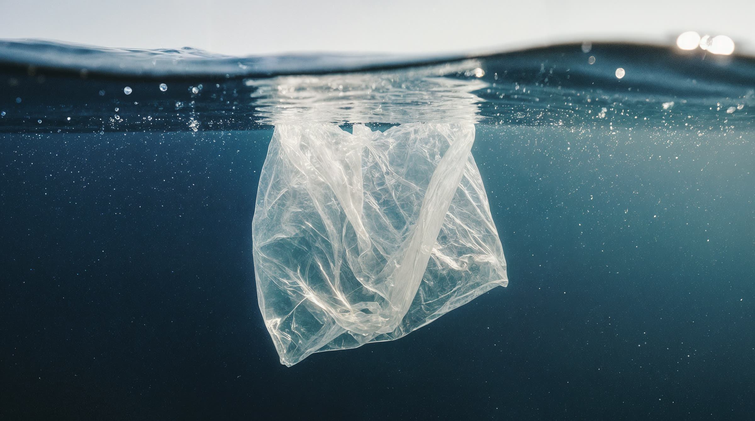
Made from unstable plant-based compounds, Polyflora mimics plastic but rejects permanence. It stiffens, bonds, and scents—only to collapse, unravel, and fade. What’s left is trace dust and the memory of form.
POLYFLORA IS A BIODEGRADABLE COMPOUND ENGINEERED FROM FLORA-DERIVED POLYMERS, DESIGNED TO DISAPPEAR, AND CREATED FOR THE FUTURE OF DAILY USE, CO-CREATED WITH ARTIFICIAL INTELLIGENCE.
Prompt: “made of a semi-transparent green biomaterial with visible plant-vein structures, micro-cracks resembling dried chlorophyll, and a leaf-like organic texture that suggests slow decomposition”
OUR PRODUCTS
These products define the material’s visual, functional, and conceptual language. Each one demonstrates how Polyflora exists in context: minimal form, active surface, constant transformation. They serve as design anchors — a reference for texture, tone, and use. Future applications should maintain this balance between clarity and decay, control and change.
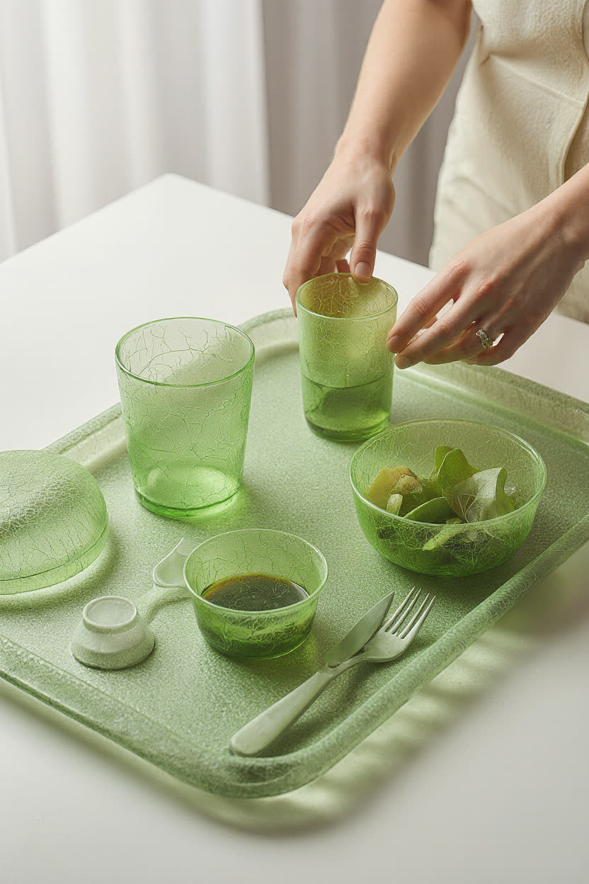
TRAY SET
A serving tray, glasses and bowls in semi-translucent Polyflora. Built for daily use, made to soften back into the ground.
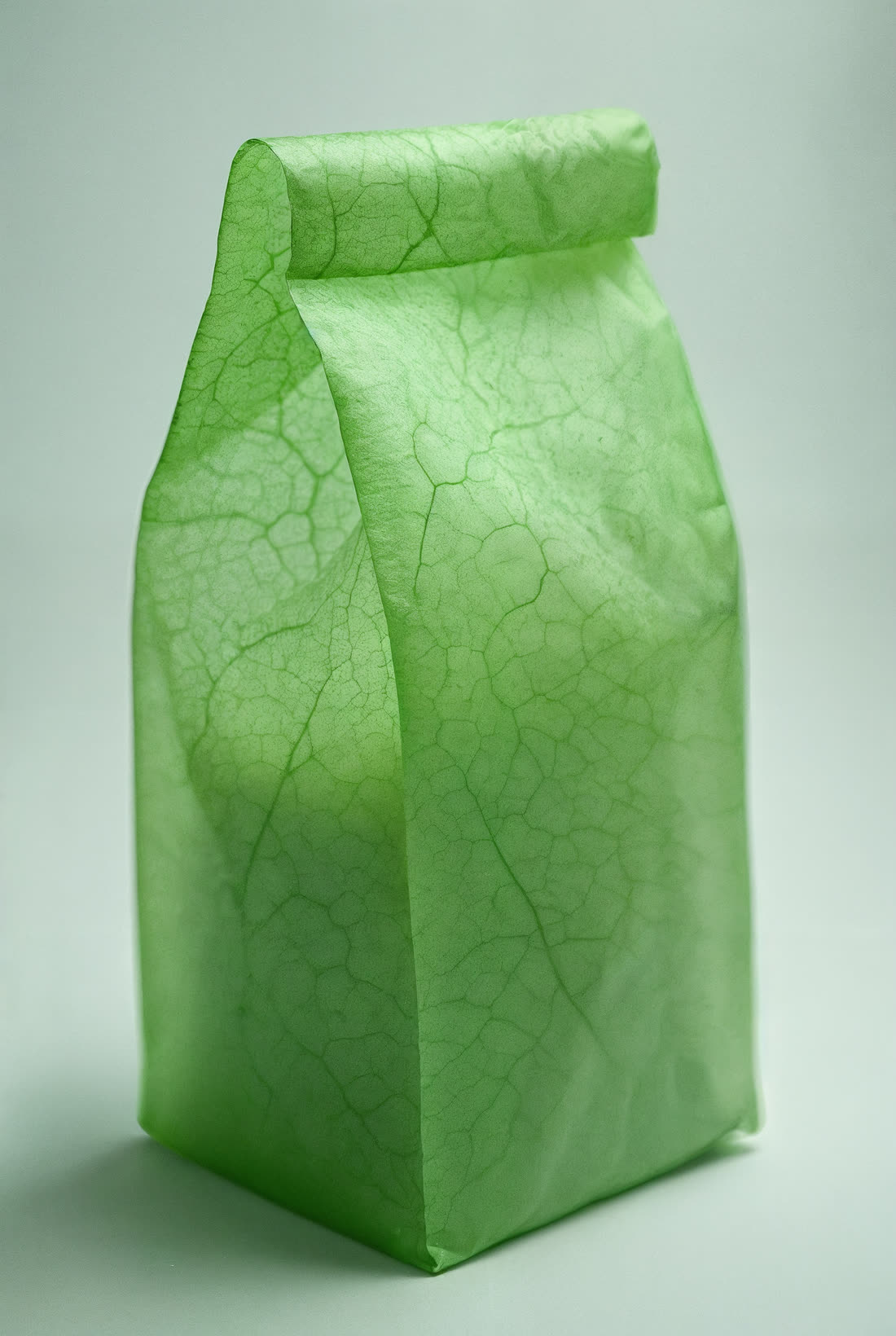
CARRIER BAG
Paper-thin and veined like the leaf it came from. It holds its shape for one cycle, then unravels.

CUP
Micro-cracks like dried chlorophyll. Clear at first, clouding as it begins to fade.
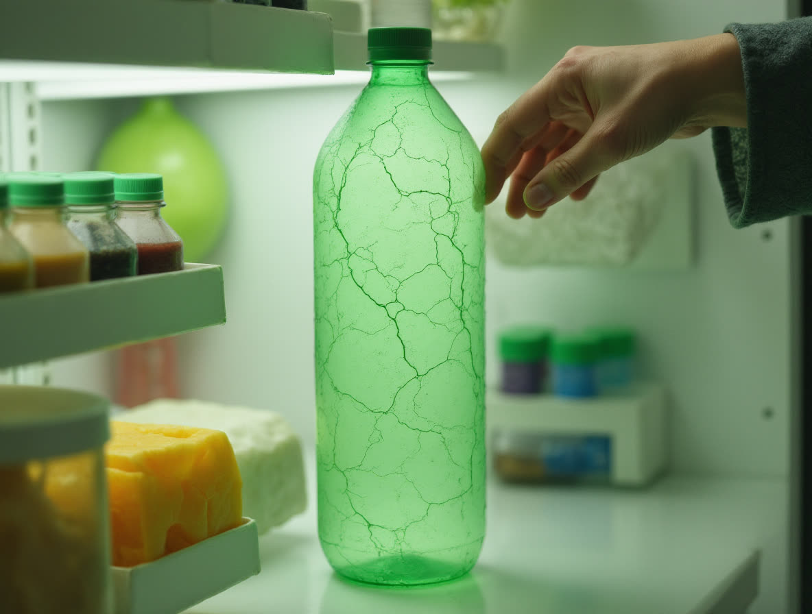
BOTTLE
Rigid on the shelf and in the fridge. When it is done, only trace dust is left.

THE
DESIGNER
The Designer is a projected presence of Polyflora — built to handle, show, and behave. She appears selectively, in moments where the system needs a human proxy. Not as a user, but as an extension of the product itself. Her movements demonstrate the logic of the material: how it folds, resists, adapts. She does not speak. She performs. She is part of the interface. Use her as reference for interaction, proportion, and tone.



 //POLYFLORA
THE LOGO
the standalone symbol — represents the core duality of Polyflora: the meeting point between the organic and the synthetic. Built from modular geometry and interrupted by curved, irregular growths, it reflects the product’s nature — structured, but constantly shifting.
THE LOGOTYPE
the wordmark — expresses that same principle through typography. Clean, constructed letterforms are partially deformed: the broken “O”, the glitched “N”, the rigid framing. It’s language under tension, shaped by the material it names.
TOGETHER
Both elements are designed to function as part of the same system — but may operate independently when context requires.
HELVETICA, REGULAR
IBM Plex Mono, REGULAR
HEADING ONE
Lorem ipsum dolor sit amet, consectetur adipiscing elit. Curabitur pulvinar non enim id bibendum. Morbi bibendum diam vitae nisl gravida, quis euismod massa convallis. Integer sapien metus, tempor eget fringilla sed, ullamcorper sit amet justo. Nam faucibus hendrerit turpis sit amet semper. Donec quis arcu sit amet quam facilisis suscipit sit amet